


LOGO OF THE XXXV GENERAL CHAPTER
Various models for the LOGO were received by the General Council; all were very beautiful and meaningful in their presentation. On the basis of the criteria suggested for the Logo, we now present the one chosen for the forthcoming General Chapter. We thank all the Provinces and Delegations for their work. All the logos will be presented below.
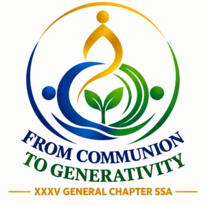
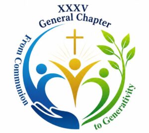
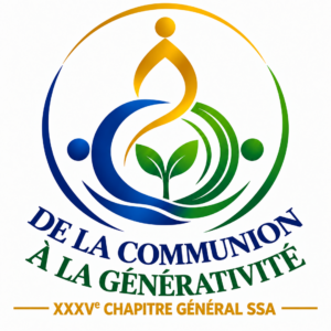
The meaning of the logo: The Trinity is the source: three Persons, only one Love. From this Love true communion is born among us. When communion has God at the centre, it becomes generative: able to bring forth new life, vocations, relationships, peace and hope.
WHAT THE SHAPES RAPPRESENT
The three points: They represent the Father, the Son and the Holy Spirit, origin of every communion and life.
The three shapes which intertwine: They symbolize the communion that is born from the Trinity and is extended among us. Distinct entities that give themselves to one another and become one single love.
The shoot at the centre: It is born from the encounter of the three shapes: it is the fruit of communion. It represents generativity, new life that grows, bears fruit and gives itself.
A wave: which lies below the shapes, represents the sea, the movement of time and of space, the world which is continuously changing and the challenges we are called to face.
The circle that envelopes: It is God’s embrace which guards and sends out. It indicates the Church and our Congregation, open to the world to generate life and hope.
THE COLOURS
Blue: It recalls the communion, the fidelity and the depth of life in God.
Green: It recalls the life that grows, the hope and the fruitfulness of the Spirit.
Gold: It recalls the light of God, His presence that generates and makes every gift fruitful
TRINITY – COMMUNION – GENERATIVITY
Without the Trinity there is no communion.
Without communion there is no generativity.

Below, you can see the various proposals for the Logo that have been submitted:
 |
 |
 |
 |
 |
 |
 |
 |
 |
 |
 |
 |
 |
|